Data Visualisation
Unlock the power of data visualization! Learn how to transform complex data into clear, engaging visuals that drive better business decisions.


- Data Analytics involves the collection, analysis, and usage of data to tell stories through charts and visualizations, enabling businesses to make better decisions.
- The combination of numbers and creativity in a marketing and advertising setting can drive impactful results.
- The visuals resulting from data analysis are more than aesthetically appealing; the stories they tell are even more captivating.
- Data analysis involves a specific skill set to extract the stories hidden within large blocks of text or numbers.
- Inspiration for data visualization can come from various sources, including news outlets, art, and photography.
- The course may be intense, but perseverance will lead to understanding the importance of these skills in the new business landscape.
- The use of data and analytics tools for decision-making is the new norm in business.
Why data visualization matters
- Data visualization is crucial in data analysis as it graphically represents data, making it easier to understand.
- Data visualization has been used for centuries, with maps being one of the earliest forms.
- Good data visualization should be clear and easy to follow, with the audience understanding the conclusion it makes within a few seconds.
- A successful data visualization combines four key elements: the data (information), the narrative (story), the function (goal), and the aesthetics (visual form).
- An effective data visualization should lead viewers to the same conclusion as the analyst, but more quickly.
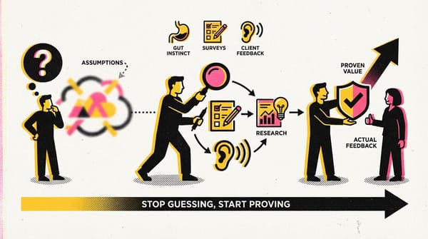
- As a data analyst, you have the power to tell convincing stories through data visualization, but you also have the responsibility to consider the perspectives of others when creating these stories.
Effective data visualizations
- Data visualization techniques can help to present complex data in an easily understandable, visual manner.
- Effective data visualization strikes a balance between providing enough information for comprehension and avoiding overwhelming detail.
- Two useful frameworks for data visualization are the McCandless method and Kaiser Fung’s Junk Charts trifecta checkup.
- Pre-attentive attributes, such as marks and channels, can be used to create immediate understanding in data visualizations.
- Data visualization is both an art and a science, requiring skill and critical thinking to create effective and meaningful visuals.
- Continuous learning and practice are key in honing data visualization skills.
Frameworks for organizing your thoughts about visualization
- Information: the data with which you’re working
- Story: a clear and compelling narrative or concept
- Goal: a specific objective or function for the visual
- Visual form: an effective use of metaphor or visual expression
You can also use these questions to determine if your data visualization is effective
- What is the practical question?
- What does the data say?
- What does the visual say?
Marks
Marks are fundamental visual objects like points, lines, and shapes. Every mark can be categorized into four qualities:
- Position: This refers to the location of a specific mark in space relative to a scale or other marks. For instance, position allows you to compare patterns of different elements.
- Size: This determines how big, small, long, or tall a mark is. Comparing object sizes can be easily interpreted by humans. However, it's important to control the scale of a visual to avoid unintended comparisons.
- Shape: The shape of an object can convey specific information. Using creative shapes that align with a given application can enhance interpretation speed.
- Color: The color of a mark can differentiate groupings or convey concepts like profitability or temperature.
Channels
Channels are visual aspects that represent data characteristics in a visualization. Channels vary in their effectiveness at communicating data based on three factors:
- Accuracy: Channels should help in accurately estimating the represented values. For example, color is accurate when communicating categorical differences but less so for quantitative data.
- Popout: This factor considers how easy it is to distinguish certain values from others using pre-attentive attributes like line length, size, line width, shape, enclosure, hue, and intensity.
- Grouping: A channel should effectively communicate groups present in the data, considering proximity, similarity, enclosure, connectedness, and continuity.
Remember, the more you emphasize a single thing, the less effective it becomes as multiple emphasized items compete for attention.
Connect images with data
- Data visualizations, including bar graphs, line graphs, and pie charts, are essential tools for communicating complex data effectively.
- Bar graphs are useful for highlighting trends and comparing values. The x-axis represents categories or variables, and the y-axis usually has a scale of values.
- Line graphs track changes over time and can compare different data sets effectively.
- Pie charts show proportions of a whole, enabling quick understanding of how different parts contribute to the total.
- Maps can hold a lot of location-based information and are easy for audiences to interpret.
- Data visualizations can sometimes be misleading, especially when not scaled or proportioned correctly. It's crucial to avoid misrepresentation of data in visualizations.
- Always ensure your visualizations are clear, easy to understand, and true to the data to avoid misleading your audience.
A recipe for a powerful visualization
- Data visualizations should be tailored to effectively communicate the findings to the intended audience.
- It's important to strike a balance in data representation - show only relevant data, but not too little that it makes the visualization unclear or less meaningful.
- Visualizations can be used to show changes over time, data distribution, rankings, and correlations among data.
- Caution should be exercised when representing correlational data to avoid implying causation where it doesn't exist.
- Different types of charts like time series charts, histograms, ranked bar charts, and correlation charts can be used based on the objective and audience.
- The choice of visualization should align with the business objective and the audience's needs.
Correlation and causation
Correlation
in statistics measures the extent to which two variables move in relation to each other. For instance, "As the temperature rises, ice cream sales also increase." It's crucial to note that correlation does not imply causation, but it does suggest a pattern or relationship between the variables. A positive correlation is when both variables increase together. A negative or inverse correlation is when one variable increases and the other decreases. If one variable increases and the other remains the same, there is no correlation.
Causation
refers to the concept that one event leads to a specific result. For instance, we hear thunder (a sound wave) when lightning strikes due to the air heating and cooling from the lightning strike. Hence, lightning causes thunder.
- Correlation and causation are two different concepts in data analysis. While correlation refers to a relationship between two variables, causation indicates that one event leads to the occurrence of another.
- Misinterpreting correlation as causation can lead to incorrect conclusions from data analysis. It's crucial to thoroughly examine the data and its context to determine whether a causal relationship exists and can be supported by the data.
- The tools used for analysis have their limitations and understanding these limitations is important for correct interpretation of the results.
- In order to identify the actual cause of a phenomenon, additional data may need to be collected and analyzed.
In your data analysis, remember to:
- Critically analyze any correlations that you find
- Examine the data’s context to determine if a causation makes sense (and can be supported by all of the data)
- Understand the limitations of the tools that you use for analysis
Dynamic visualizations
- There are two types of visualizations: static and dynamic. Static visualizations do not change over time unless edited, while dynamic visualizations are interactive or change over time.
- Static visualizations provide control over the data and the data story. They are often used in spreadsheets and print media.
- Dynamic visualizations give users some control over what they see. This is useful if stakeholders want to adjust what they're viewing. For example, Tableau provides automatically interactive visualizations.
- Dynamic visualizations can also update new data automatically, showing trends in real-time.
- The choice between static and dynamic visualization depends on the data being visualized, the audience, and the presentation method.
- It's important to balance interactivity and control in visualizations. More power to the user means less control over the data story.
The wonderful world of visualizations
- Presenting your data visually is an effective way to communicate complex information and engage your stakeholders.
- There are multiple types of visualizations, each with its own strengths and ideal applications: line charts for tracking changes over time, column charts for contrasting and comparing values, heatmaps for showing relationships between two variables with color-coding, pie charts for showing proportions of a whole, scatterplots for showing relationships between different variables, and distribution graphs for displaying the spread of various outcomes in a dataset.
- Choosing the right visualization depends on the patterns and relationships within your data. These could include changes over time, clusters of similar values, proportions relative to a whole, rankings, or correlations between variables.
- Data analysts must not only collect and interpret data, but also present it in a meaningful and digestible way. This often involves studying data patterns and choosing the most effective visual representation.
Data grows on decision trees
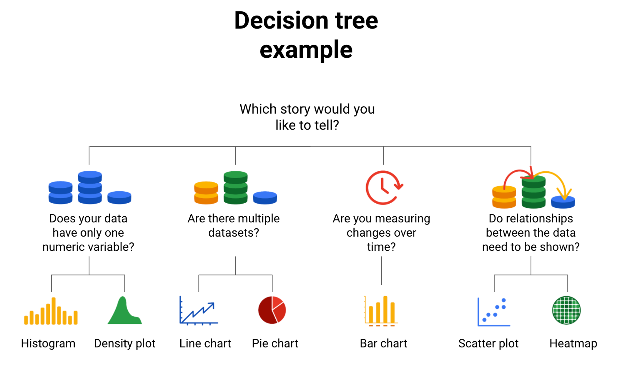
Start with your data
Determine the best visuals based on your data:
- Single numeric variable? Use histogram or density plot for continuous data. Bar chart could be suitable too, for example, student heights.
- Multiple datasets? Line or pie chart can represent multiple data sets. Line charts show trends over time. Pie charts divide a whole into parts, like quarterly sales figures.
- Measuring time changes? Line charts plot trends over time. For larger changes, use bar charts, e.g., NYC visitor numbers over 6 months.
- Need to show data relationships? Two variables can be shown on a scatterplot. If there are many data points, a heat map can be clearer, e.g., population across US states. A scatterplot can show relationships like study hours and grades.
Key Takeaways
- Decision trees can guide data analysts in choosing the best way to visualize their data.
- Different types of data require different visualizations; a single numeric variable might best be represented by a histogram or density plot, multiple datasets might be best shown with a line or pie chart, changes over time can be shown with a line or bar chart, and relationships between data might be best represented with a scatter plot or heatmap.
- The complexity and specifics of the data, such as the number of variables or data points, can also influence the choice of visualization.
- There are additional resources available that provide more comprehensive decision trees and guides for choosing the best chart for your data.
What Makes a Good Visualization?
Elements of art
- Line
- Shape
- Color
- Hue
- Intensity
- Value
- Space
- Movement
- Both data analysts and artists use elements of art in their work, such as line, shape, color, space, and movement.
- Lines can add visual form to your data and help build a structure for your visualization.
- Shapes in visualizations should always be two-dimensional to avoid confusing the audience.
- Colors can be described by their hue, intensity, and value, and varying the color's value can be an effective way to draw the audience's attention.
- There should always be space in data visualizations, but not too much or too little.
- Movement, used sparingly, can create a sense of flow or action in a visualization.
- When incorporating movement and interactivity, the story is controlled by whoever is controlling the interactivity.
- The combination of these art elements in a visualization can create a compelling and meaningful visual representation of data.
Principles of design
Basic Principles of Design for Data Analysis
There are nine fundamental design principles for data analysts creating visualizations:
1. Balance: Distribute key visual elements like color and shape evenly. Balance doesn't need symmetry but should avoid distractions. For instance, a column chart can be balanced without being symmetrical due to consistent colors, width, and spacing.
2. Emphasis: Important data should be the focal point. Use color and value contrasts to make key graphic elements stand out, like in a heat map where colors denote search interest intensity.
3. Movement: Movement refers to the viewer's eye path or animations. Use lines and colors to guide attention across the page, like the average line in a combo chart.
4. Pattern: Use similar shapes and colors to create patterns highlighting data set similarities or differences. Breaking a pattern with a unique element can emphasize it.
5. Repetition: Repeating chart types, shapes, or colors enhances visualization. In a stacked column chart, color repetition can help compare data sets.
6. Proportion: Use different colors and sizes to highlight specific visuals. Proportion reflects the importance of data in a chart, like in a dashboard where chart size denotes significance.
7. Rhythm: Create a movement sense or flow. If the design lacks flow, rearrange elements to enhance rhythm.
8. Variety: Use a variety of chart types, lines, shapes, colors, and values to keep the audience engaged. Balance is crucial to avoid confusion.
9. Unity: Ensure the final visualization is cohesive and well-organized.
These principles can guide analysts in creating effective and engaging visualizations.
Key Takeaways
- The nine basic principles of design are essential for creating effective data visualizations.
- Balance in a visualization is achieved by the even distribution of key visual elements.
- Emphasis is creating a focal point in your visualization for the audience.
- Movement guides the viewer's eye across the visualization.
- Pattern involves using similar shapes and colors in your visualization to highlight similarities or create emphasis.
- Repetition of chart types, shapes, or colors can enhance the effectiveness of your visualization.
- Proportion can be used to demonstrate the importance of certain data.
- Rhythm refers to creating a sense of movement or flow in your visualization.
- Variety in chart types, lines, shapes, colors, and values can keep the audience engaged.
- Unity ensures that the final data visualization is cohesive and well-organized.
Data visualization impact
- The choice of visualization greatly depends on the user's understanding and interpretation. The simpler it is for the user to understand, the better.
- Different visualizations serve different purposes, and the choice should suit the needs of your audience and the specific task at hand.
- Line graphs, bar graphs, stacked bar graphs, and area charts are effective for representing data changes over time.
- Ordered bar, and group bar graphs, and ordered column charts are useful for comparing distinct objects.
- Stack bars, donuts, stacked areas, pie charts, and tree maps can show parts of a whole, a method known as data composition.
- Scatterplots, bubble charts, column/line charts, and heatmaps are useful for showing relationships in data.
- An effective visualization has a clear meaning, sophisticated use of contrast, and refined execution.
- Always keep the audience in mind when creating a visualization. The easier it is for them to understand what they're looking at, the more successful your visualization will be.
Data is beautiful
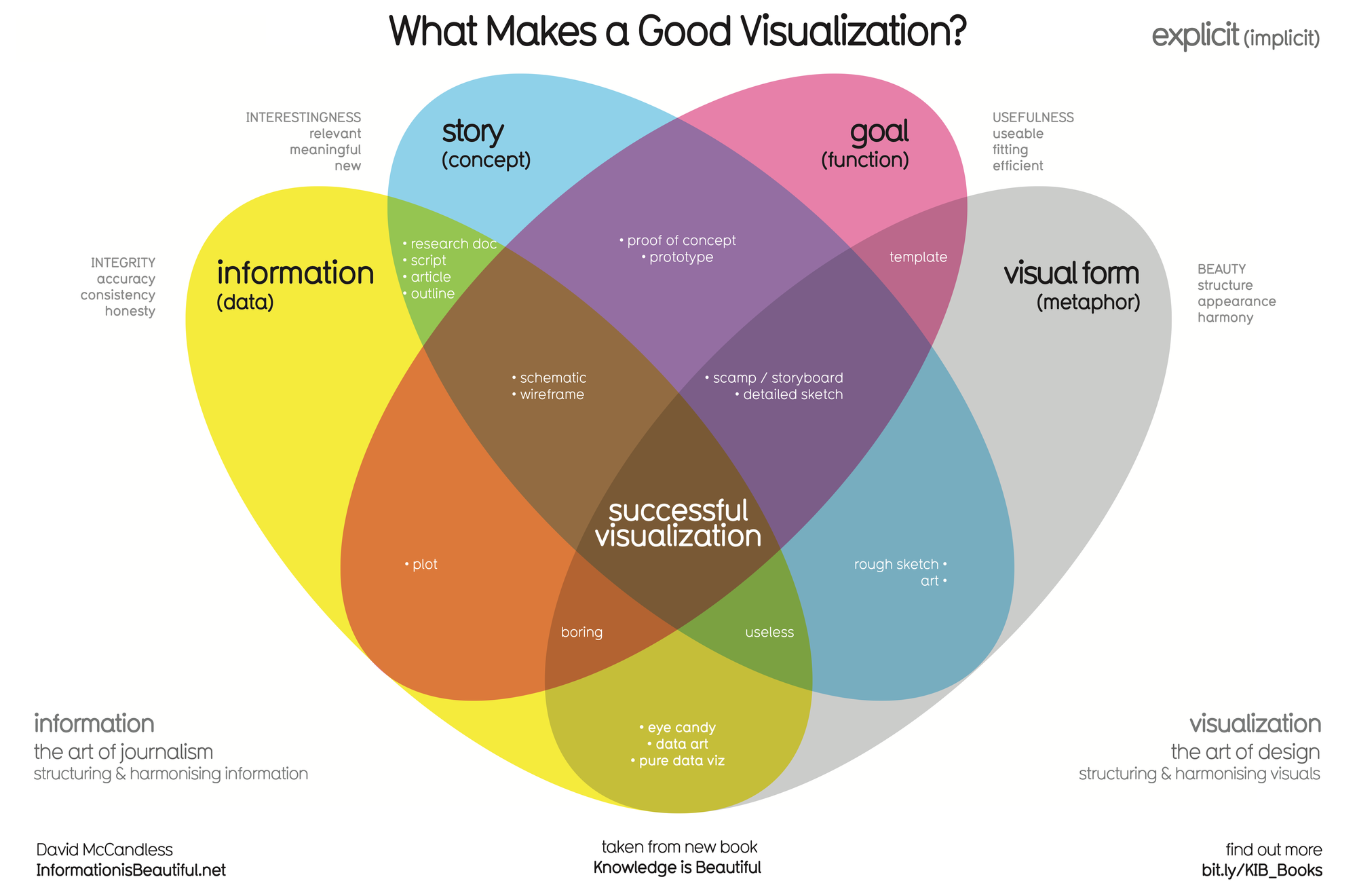
Four Elements of Successful Visualizations
David McCandless's Venn diagram identifies four elements crucial to successful visualizations:
- Information (data): The essential building block of your data visualization is the information or data you aim to convey. Without it, effectively communicating your findings becomes impossible.
- Story (concept): The story enables you to present your data in engaging and meaningful ways. Without a story, your visualization may be informative but lacks inspiration.
- Goal (function): The goal provides your data visualization with a purpose, making the data useful and usable. Without a goal, your visualization might be informative, but it can't produce actionable insights.
- Visual form (metaphor): This element gives your data visualization structure and aesthetic appeal. Without a visual form, your data remains unvisualized.
Observe how these visualizations successfully balance all four elements: data, storytelling, goal orientation, and aesthetic structure. They not only incorporate data but also use storytelling to imbue it with meaning. They focus on a specific goal and structure the data with visual forms for beauty and communication. The more you think about these elements, the more effectively you can incorporate them into your own data visualizations.