Storytelling with Data
Unlock the power of storytelling with data! Learn to craft compelling narratives that inform, engage, and persuade your audience effectively.


- Stories are powerful tools for teaching and sharing knowledge, not just entertainment.
- Data analysts are storytellers who use data, visuals, and narratives to inform and persuade.
- A data narrative explains the origin and purpose of data, providing context to findings.
- Visuals aid in bringing data insights to life and making them easier to understand.
- Effective data storytelling combines narrative and visuals to create a comprehensive and compelling picture.
- The goal is to craft a story that is both informative and persuasive for the audience.
Explain, Enlighten, and Engage
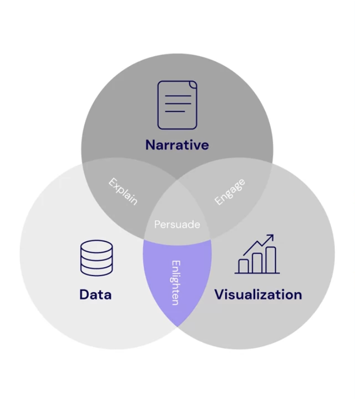
- The three Es of data storytelling are: Explain, Enlighten, and Engage.
- Effective data storytelling combines data, narratives, and visuals.
- Data and narrative explain the situation and provide context.
- Data and visualization enlighten the audience by clearly showing what the data means.
- Narrative and visualizations engage the audience, helping them internalize the information.
- The goal is to lead the audience to an "aha moment" where everything clicks.
- A good data story transforms raw data into a compelling narrative that persuades the audience.
Telling a Compelling Story
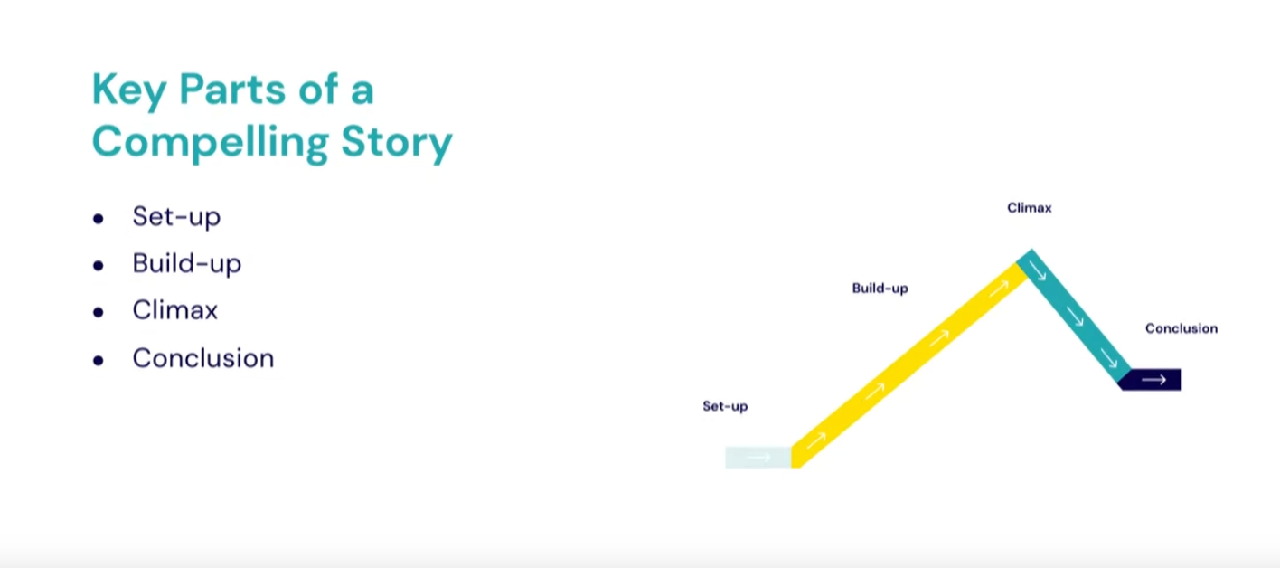
- A compelling data story typically consists of four parts: setup, buildup, climax, and conclusion.
- Start with a hook to capture the audience's interest, often in the form of a question derived from curiosity.
- The buildup involves describing the investigative steps and communicating findings from data exploration.
- The climax is where you explain the root cause of the issue using your key finding.
- In the conclusion, present actions to remedy the issue and discuss potential causes.
- Storytelling with data is particularly important when insights are hard to understand or have a large impact on the business.
- Look for underlying stories in data that shows unexpected, unpleasant, complex, costly, or surprising information.
Remember, while not all data interpretations require a story format, using narrative techniques can make your insights more impactful and memorable.
iNterpreting Data & Storytelling
The iNterpret checklist is a two-step process for understanding and explaining data analysis results.
- Step 1 focuses on understanding the analysis results through critical questions about objectives, data insights, and confidence levels.
- Step 2 involves explaining findings through a structured presentation with five key components: recap, method, visualization, explanation, and recommendation.
- This approach ensures a comprehensive understanding of the data and effective communication of insights to stakeholders.
- The checklist emphasizes the importance of considering the analysis's business context and potential limitations.
iNterpreting Data
- Data interpretation is crucial for making analysis impactful and actionable in an organization.
- A well-structured presentation follows the OSEMN process: Obtain, Scrub, Explore, Model, and iNterpret.
- Effective presentations include clear objectives, methods, visualizations, explanations, and recommendations.
- The presentation structure should guide the audience through setup, buildup, climax, and conclusion.
- Visualizations play a key role in engaging the audience and making complex data understandable.
- Recommendations based on data insights are essential for applying the analysis in a business context.
- A logical progression in the presentation helps make the analysis easy to follow and conclusions more compelling.