Tableau dashboard
Unlock the power of Tableau dashboards! Learn to design effective, user-focused visuals that drive insights and enhance decision-making.

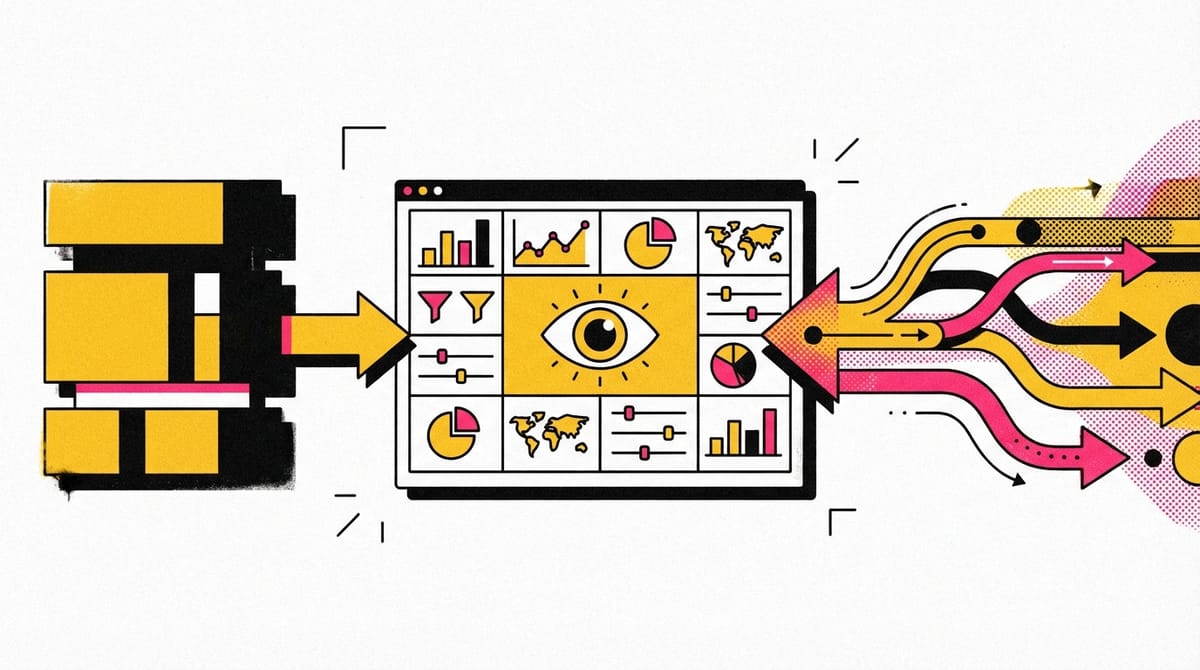
- Dashboards are essential tools: They help visualize and track important information in a clear and engaging way, similar to a car's dashboard.
- Design with the user in mind: Tailor dashboards to the specific needs and usage patterns of your stakeholders to avoid confusion and ensure clarity.
- Start simple: Begin with the most crucial data points and adjust as needed, ensuring a balanced and cohesive layout.
- Understand layout options: Use vertical or horizontal layouts, and choose between tiled or floating items to create organized and effective visuals.
- Be prepared to share: Sharing dashboards can lead to collaborative problem-solving and innovation, even though it means giving up control over the data narrative.
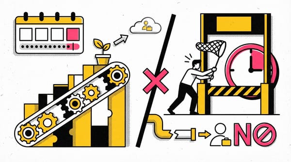
Live and static insights
Live versus static
Identifying whether data is live or static depends on certain factors:
- How old is the data?
- How long until the insights are stale or no longer valid for making decisions?
- Does this data or analysis need regular updates to remain valuable?
Static data involves providing screenshots or snapshots in presentations or building dashboards using snapshots of data. There are pros and cons to static data.
PROS
- Can tightly control a point-in-time narrative of the data and insight
- Allows for complex analysis to be explained in-depth to a larger audience
CONS
- Insight immediately begins to lose value and continues to do so the longer the data remains static
- Snapshots can't keep up with the pace of data change
Live data means you can build dashboards, reports, and views connected to automatically updated data.
PROS
- Dashboards can be built to be more dynamic and scalable
- Provides the most up-to-date data to the people who need it when they need it
- Allows for up-to-date curated views into data with the ability to build a scalable “single source of truth” for various use cases
- Enables immediate action on frequently changing data
- Reduces time/resources spent on processes for each analysis
CONS
- Requires engineering resources to keep pipelines live and scalable, which may be beyond some companies' data resource allocation
- Without the ability to interpret data, you can lose control of the narrative, causing data chaos (i.e., teams coming to conflicting conclusions based on the same data)
- Can potentially cause a lack of trust if the data isn’t handled properly
Key takeaways
Analysts need to familiarize themselves with the business and data to recommend when an updated static analysis is needed or should be refreshed. This data insight will also help you advocate for the types of analyses, visualizations, and additional data recommended for the business decisions that need to be made.
From filters to charts
- Understanding your audience is crucial for creating effective data visualizations and dashboards.
- Filters are a powerful tool to show only the data that meets specific criteria, making it easier to focus on important information.
- Tableau allows for various filtering options, including prefiltering data for stakeholders.
- Filters can be used to highlight or hide individual data points, but outliers should be investigated before removal.
- Spreadsheets like Google Sheets and Excel offer functionalities for quick visualizations, including various chart types and customization options.
- Using filters and charts helps cut through data clutter, allowing for clearer, more compelling data stories.
- Accessible color schemes can make visualizations more understandable for audiences with color vision deficiencies.
- Preparing a data narrative is the next step in effectively communicating insights.