Visualization considerations
Master effective data visualization with essential guidelines and pro tips to ensure clarity and elegance in your presentations.

Guidelines and pro tips
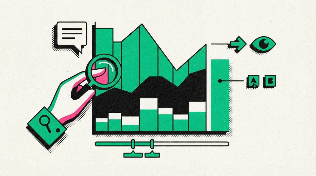
Refer to the table below for recommended guidelines and style checks for headlines, subtitles, labels, and annotations in your data visualizations. Think of these guidelines as guardrails to prevent your visualizations from becoming too crowded or busy. This can confuse or distract the audience with unnecessary elements. These guidelines and style checks will help maintain simplicity and elegance in your data visualizations.
| Visualization components | Guidelines | Style checks |
|---|---|---|
| Headlines |
|
|
| Subtitles |
|
|
| Labels |
|
|
| Annotations |
|
|
Key takeaways
Aim to be informative without being overly detailed. For effective communication of your data analysis results, use appropriate visualization components in a suitable style. In other words, let simplicity and elegance combine to help your audience understand the data you're presenting in five seconds or less.
Accessible visualizations
- Over 1 billion people worldwide have a disability, so when designing data visualizations, it's important to make them accessible to all audiences, including those with disabilities.
- Labeling data directly instead of relying exclusively on legends can make the visualization easier to understand.
- Providing text alternatives for visualizations can make them accessible to those with visual or certain cognitive disabilities.
- Data from charts and diagrams should be available in a text-based format, such as an export to Sheets or Excel.
- Using bright colors that contrast against the background can aid those with poor visibility.
- Avoid relying solely on color to convey information, consider using different textures and shapes instead.
- Simplifying visualizations can make them more effective, as overly complicated data visualizations can turn off most audiences.
- Think about your audience ahead of time and focus on creating simple, easy-to-understand visuals.
Making data accessible
- Accessibility should be incorporated into all aspects of data visualization to ensure everyone can interact with the data, regardless of any impairments.
- Data visualizations often deal with color and contrast, which can be challenging for those with visual impairments.
- As data visualizations are shared and presented by others, the original creator won't be there to navigate or explain it. Therefore, it needs to be clear and easy to understand.
- Focusing on accessibility not only makes data more inclusive but also makes you a better data analyst and storyteller. It forces you to be more empathetic towards your audience and makes your data more clear and impactful.
- The goal of data visualization is to convince others of the value of the data and persuade them to take action based on it.
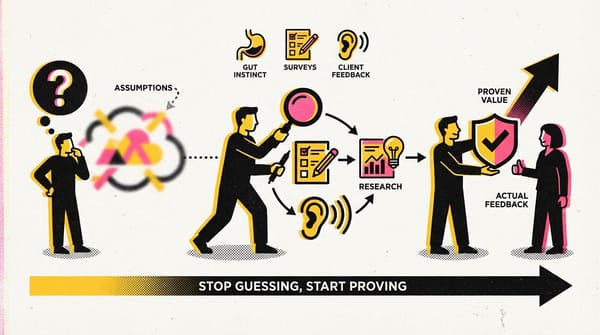
Design a chart in 60 minutes
Here's the breakdown of the 60-minute chart creation process:
Refer to this 60-minute chart as a high-level guide when starting a data visualization project.
Preparation (5 min): Set up the mental and physical space for comprehensive thinking. This includes brainstorming the visual representation of your data and considering the quantity and type of data.
Talk and Listen (15 min): Identify your work's purpose by understanding the underlying request and setting expectations. Ask questions and listen to stakeholders' feedback about your project to refine your data layout.
Sketch and Design (20 min): Draft your approach to the problem. Define the timing and output of your work for a clear and concise concept of what you're creating.
Prototype and Improve (20 min): Generate a visual solution and assess its effectiveness in accurately conveying your data. Iterate the process until you produce the final visual. It's okay to go through several visuals before finding the perfect fit.
Key Takeaways
- A well-structured process can help in creating data visualization in a short amount of time.
- Preparation is key to setting up a conducive environment for comprehensive thinking.
- Active communication with stakeholders can provide significant insights for data layout.
- The sketch and design phase is where you define your concept and plan your work.
- Prototyping and improving the visual representation of your data are crucial steps to ensure that your chart accurately communicates the intended information.
- Iterative process in design is normal and often necessary to find the perfect fit.


